Life minus colours will be pretty dull, grey, and literally a snooze fest! However, colours, my friends, also have the power to throw our emotions into a frenzy. Ever waltzed into a room and felt your mood either nose-dive or skyrocket? Or felt inexplicably irritated in some space and blissed out like a Zen master in another? Colours are emotional hijackers, which pull on to our mood strings like no other.
So, the next time you blame the universe for your cranky mood, glance around — those cheeky hues could be the real culprits tinkering with your feelings, behaviour, and mood. While shades evoke certain emotions, colours have also been associated with physiological issues, including increased blood pressure, hypertension, and eyestrain. That is why it is essential to consider colour psychology while designing homes to create an atmosphere that vibes just right for your space.
So, what exactly is colour psychology?
Simply put, colour psychology studies how colours affect human behaviour, emotions, and perceptions. So, if you plan to add a pop of colour or decorate your entire room, read on; we have all the info you need for nailing those hues.
Power of Pink
Nah, pink is not just a girl thing! It’s about time we bury such ancient notions. Embodying playfulness, innocence, and tranquillity with a touch of whimsy, pink is known to create a warm, welcoming, and compassionate atmosphere. Research even shows that shades of pink can calm your mind and tame your inner hulk, as it is known to lessen aggression. So, don’t underestimate the power of pink and consider it for a dreamy bedroom, snazzy bathroom, or a chic living room.
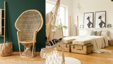
Stress-Free White
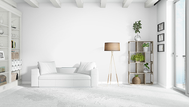
The colour white undoubtedly rules the interior designing stage, and rightfully so. White represents purity, innocence, and simplicity and is also a versatile colour with textures, accents, furniture and other colours, making it a hot favourite in any décor style. A symbol of cleanliness and simple life, white is also known to help reduce tension and enhance creativity, thus making it an ideal choice in almost every corner of your home. From living rooms to bedrooms, white is your go-to for that fresh, calm exuding Zen space.
Charming Blue
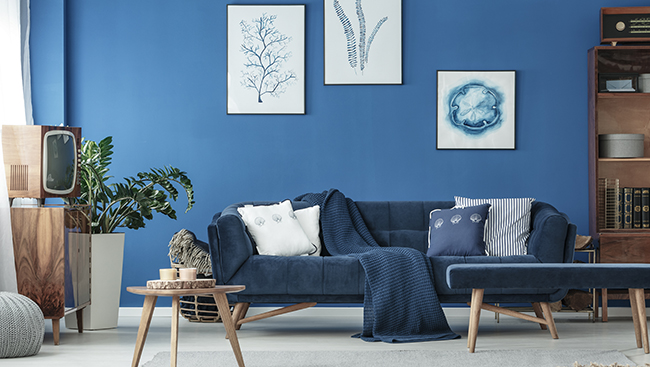
The colour blue is a mood magician, and incorporating this superstar of colour psychology into any space uplifts the mood and has plenty of health benefits. Be it the deep shades of navy or bold cobalt blue or the dreamy sky blue, all shades of this hue have a calming effect and are known to soothe the heart, mind, and hypertension. Furthermore, studies have shown that the tranquil nature of this colour helps restless minds and positively impacts sleep quality, making the shade an ideal choice for bedrooms. As the oh-so-cool blue is known to enhance one’s focus, it is also perfect for study rooms and living rooms.
Instructions:
Sunshine Yellow
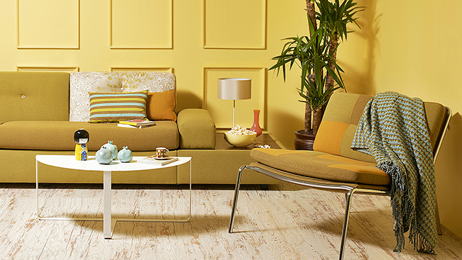
Need a burst of joy in your space? Yellow is your go-to hue. Known for its lively charm, yellow is associated with prosperity, intelligence, happiness, and sophistication in colour psychology. It is a perfect choice to keep the vibe of your space lively and joyful—however, yellow needs to be handled with caution, care, and aesthetics. While too much yellow can make your space look tacky, rooms decorated from ceiling to floor in yellow can also impact your mood negatively and spike up your blood pressure. Hence, it is advised to tread lightly with yellow in your décor. The best spaces to incorporate this hue are the hallway, bathroom, dining room and kitchen.
Energizing Red

It is no surprise red is linked to passion, love, dominance, power, and prestige in colour psychology. Whether blood red, brick red, or any other shade of this hue, red is unmistakably fierce and exudes power. Psychologists believe that red makes people more accurate, focused, and cautious. However, like yellow, red has its cons and can lead to negative emotions like anger, so it is best to combine it with soothing colours like white or beige while decorating your space with red. Red encourages conversations when used in spaces like the dining room and living area. It can also be used in the hallway to leave a lasting first impression on guests. Red is also great for creative spaces and bedrooms.
Regal Purple
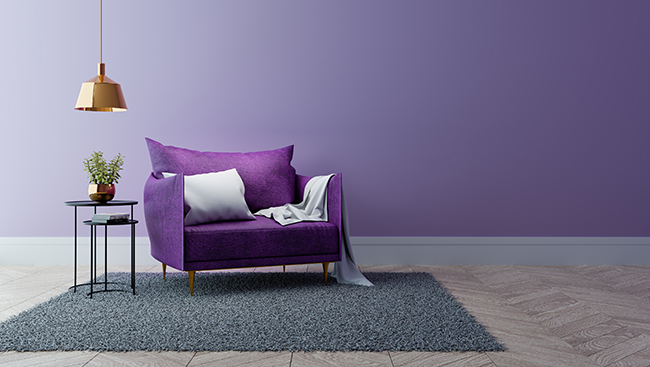
Mysterious, spiritual, and royal, the colour purple is often associated with several emotions in colour psychology, but most interior designers often use shades of this nobility to inspire creativity. It also enhances sensitivity in children but should be used sparingly as it negatively impacts sleep patterns. Use it in the dressing room or the hallway to impress guests or the in-house art studio. For the rest of the space, use it as accents, gallery walls, upholstery, furniture pieces, etc. Remember, let purple reign in your spaces, but not create a riot.